Design notes: glass, calm, and the oklch color space
A look under the hood at how Brain stays visually quiet — translucent surfaces, an aurora backdrop, and a color system that mirrors perfectly between light and dark.
2 min readAbraham Cepeda
Calm isn't the absence of design — it's a lot of small decisions pointing the same way. Here's how Brain's interface tries to stay out of your head so your own thoughts have room.
Translucency over borders
Most apps separate things with lines and boxes. Brain leans on glass: surfaces that let a little of the background through, with a soft edge highlight instead of a hard border. Content feels layered rather than boxed, and the eye relaxes because nothing is shouting for a boundary.
Every panel is one of two intensities — soft for reading surfaces, strong
for controls — so the hierarchy is consistent everywhere without a single new
color.
An aurora, not a wallpaper
Behind the glass, a few large gradient orbs drift slowly across the page. They
move over tens of seconds, well below the threshold where motion distracts, and
respect prefers-reduced-motion for anyone who'd rather they hold still. The
effect is warmth and depth without imagery to load or parse.
Why oklch
Brain's colors are defined in the oklch color space instead of hex or hsl. That choice pays off in one specific way: lightness is perceptual, so a token at the same lightness reads as equally bright whether its hue is violet or amber.
That makes the light and dark themes true mirrors of each other. We set a token's lightness once and both themes stay balanced — no hand-tuning a dozen shades per mode, no washed-out dark theme.
The best interface is the one you stop noticing.
Even the blog covers
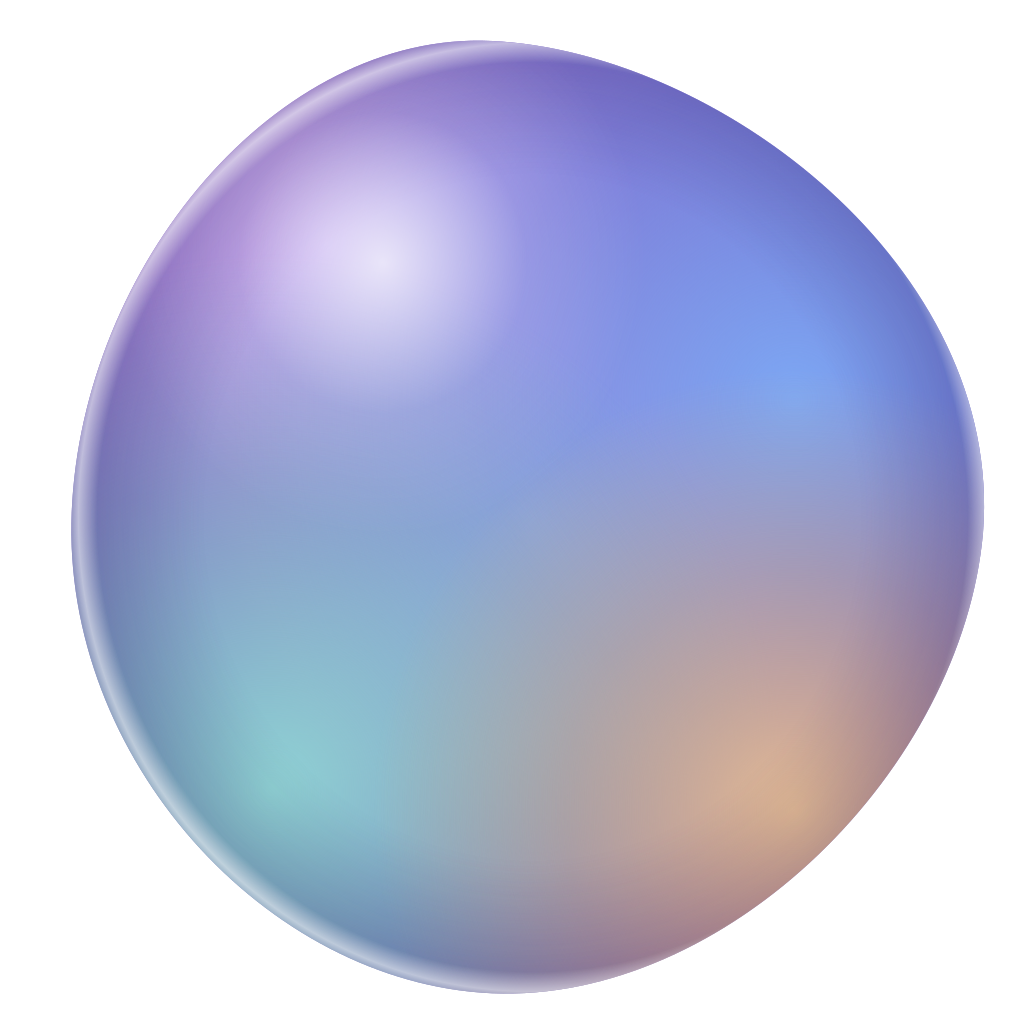
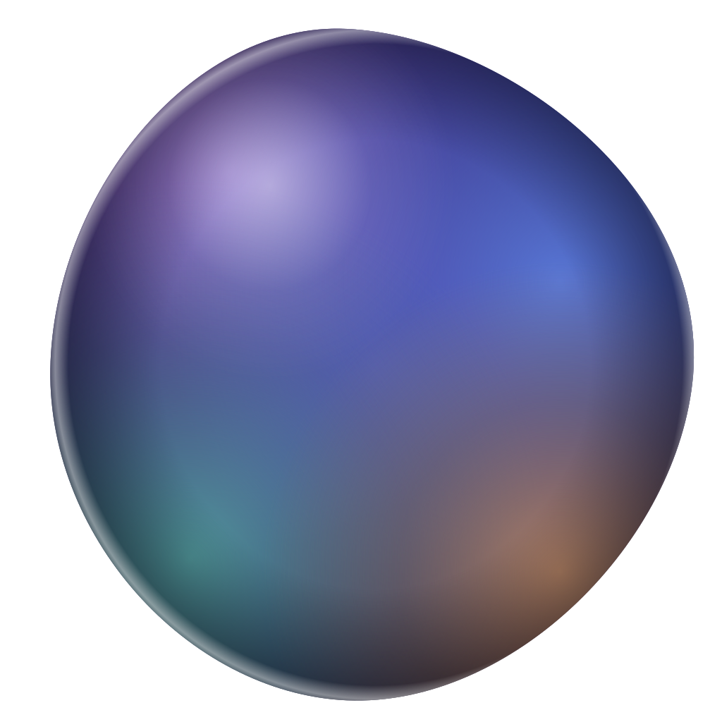
The cover art on these very posts is the same idea, taken one step further: each one is a generated oklch gradient plus a small geometric motif, picked deterministically from the post. No stock photos, nothing to download — just color and math, matching the rest of the room.